Project Overview


Some pages from the book


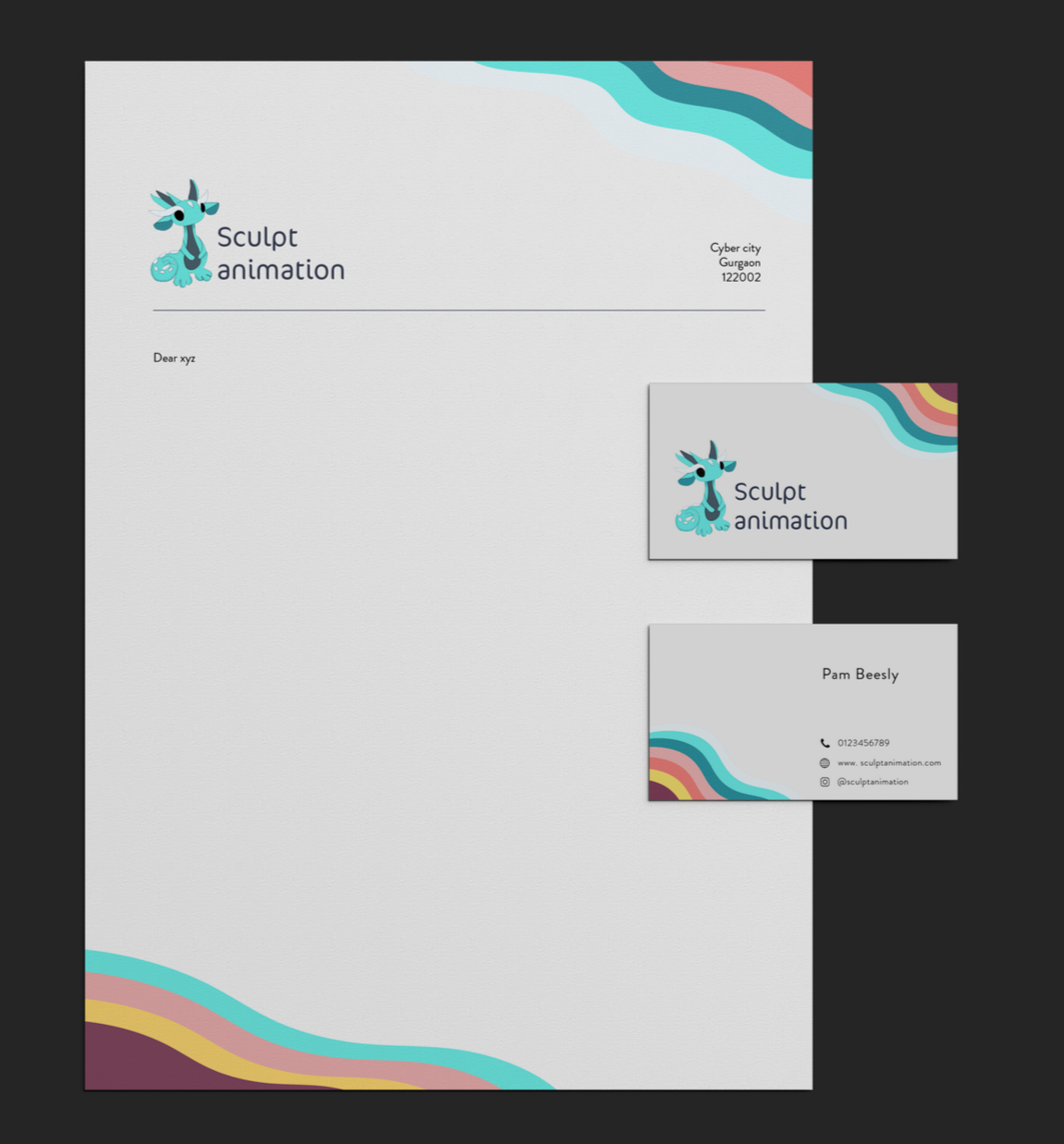
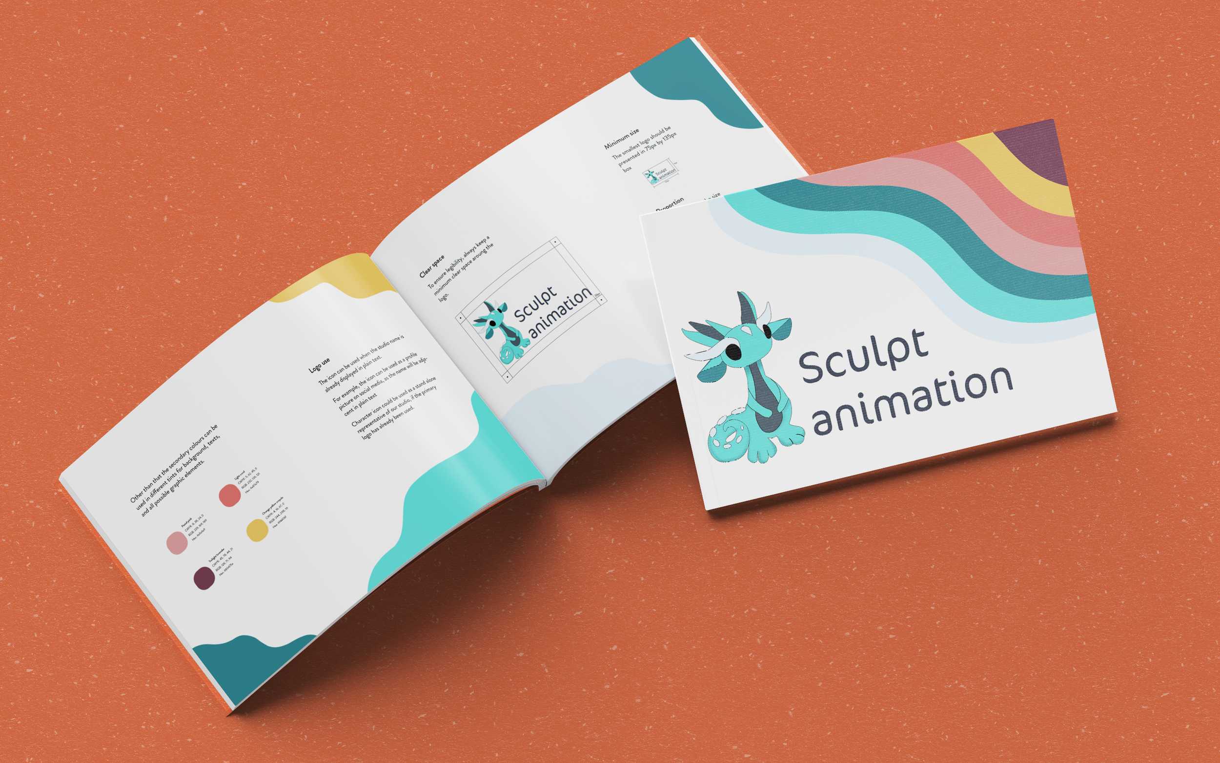
This brandbook was created to establish a cohesive visual language that reflects the studio’s tactile craft, imaginative storytelling, and experimental spirit.
The visual system draws from the character’s soft, rounded forms. Organic, flowing background shapes echo the fluidity of clay and paper craft materials used in stop-motion.
The brandbook defines:
Logo structure and variations
Character usage and integration
Color palette and application
Typography system
Layout principles using organic forms
Overall, the goal of this project was to create a visual identity that feels tactile, lively, and story-driven.